
skeuomorph
[skyoo–uh-mawrf]
ExamplesWord Origin
See more synonyms for skeuomorph on Thesaurus.com
noun
-
an ornament or design on an object copied from a form of the object when made from another materialor by other techniques, as an imitation metal rivet mark found on handles of prehistoric pottery.
Within the last few years there have been countless articles with the explicit statement that skeuomorphism (prepare to see this word a lot in this article) is now dead, but is this really the case? There seems to be a bit of schism in the design community on whether skeuomorphic design is dead or if it’s actually coming back. If you’ve ever used an Apple product you’ve likely experienced skeuomorphic design and depending on your experience it could be either really good or for bad.
Originally, skeuomorphism was a way to guide users into the digital age by providing them with nostalgic digital metaphors that hearkened back to the comforting analogs of more fabled eras.
At its very core, that is what skeuomorphism is; giving users analog aesthetics that may even mimic function along with form or even heavily analog based interfaces in a digital UI. The latter of this definition is generally what garners the most criticism from today’s UX designers and tech savvy users alike.

“Are you tempted to scroll this page with this comforting digital analog”
The newer debate is that flat design (simple two dimensional and straightforward) is posited as being more forward thinking than skeuomorphic design and that it no longer tethers users to antiquated UX heuristics.
The problem with this thinking is that skeuomorphic design is being treated as a wholly analog derived and driven experience, but this assumption is somewhat incorrect.
Skeuomorphic design can actually co-exist alongside flat and minimal design. One example of this is having skeuomorphic icons (like a notepad icon for a note app) this kind of skeuomorphic design really isn’t going anywhere for a while.

“Flat design with skeuomorphic analog inspired icons”
Now, there are also types of apps that may combine both flat design UX functionality with skeuomorphic aesthetics, such as little analog details within a calendar app. We are in fact still seeing this in app design and if anything, skeuomorphism is starting to make a bit a comeback.
Some simple mobile apps actually utilize skeuomorphism so completely that it’s actually brilliant, simple and not tacky. One example is this credit card app below
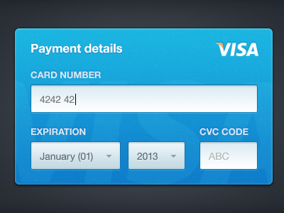
“There is nothing in this design that would confuse a user – in fact being such an almost exact replication of a credit card layout that it would actually make things easier on most users than a flat design would.”
Skeuomorphism is really only bad when the aesthetic is so faithfully constrained to its analog based counterpart, that it prevents users from easily navigated an app’s interface as well as reinforcing their familiarity with poorly designed and yet established app navigation heuristics.

“Skeuomorphism is really only bad when the aesthetic is so faithfully constrained to its analog based counterpart”
Over the years, Microsoft is a company that has showcased examples for both good and some pretty horribly designed “flat” UI elements in websites, apps and Windows itself. Truth be told I kind of liked the Windows mobile aesthetic (though it was horrible for a desktop OS).

“Even though this picture represents flat design at its core, you can still spot some skeuomorphic design in the icons”
Apple is a good example of a company that also became famous and then later, somewhat infamous, for their over-the-top skeuomorphic design prevalent throughout IOS that was highly favored and championed by Steve Jobs.
Apple utilized a lot of realistic looking analog materials in their design: wood, leather, stitching.
Strangely, Apple would later take cues from Google and flatten a lot of their design aesthetics in IOS which took away from some of their defined identity.

” An impressive and yet confusing WinAmp skin”
The real problem stated earlier is that overdone skeuomorphism can hold back intuitive interfaces and can also “train” users on getting stuck in these established methods for navigating an app’s interface. Flat design presents the same problem in the other direction – we’ve all used overengineered apps that were made by developers with little thought on UX or the end user’s experience.

“Now, while i don’t completely agree with this statement, it would be easy to argue that the button on the left has a more tactile feel and would be more obviously a button, to most users”

The truth lies somewhere in-between – overly flat design can look just as tacky and can be just as hard to navigate as an overly drop-shadowed skeuomorphic nightmare app laden with cross-stitched shiny leather and steampunkish typewriter keys.
